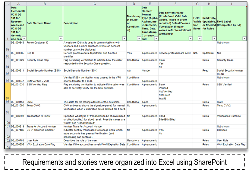
Visio was used to create a stencil library of common UI components and a template with a static header and footer to facilitate easy comp buildout for reviews. The stencils and template facilitated rapid onboarding knowledge transfer and quicker creation of wireframes for design reviews. It also served as Standards and Guidelines Governance, and as a reference for developers to ensure their code was compliant with approved UX/UI pattern libraries. This unified user experience and interface would allow a single customer service representative to provide multiple types of card-servicing, eliminating transfers and dropped calls.
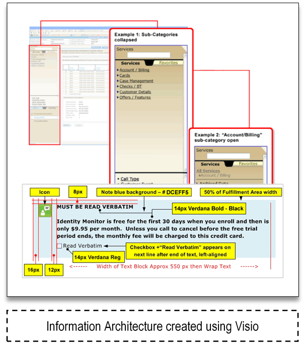
This company interchanged ‘comps’ (color-perfect/pixel-perfect JPG pre-development ‘screenshots’) with ‘wireframes’. These wireframes were then used to verify final screen designs were developed according to UX standards set forth by the HFE group in the development demos.
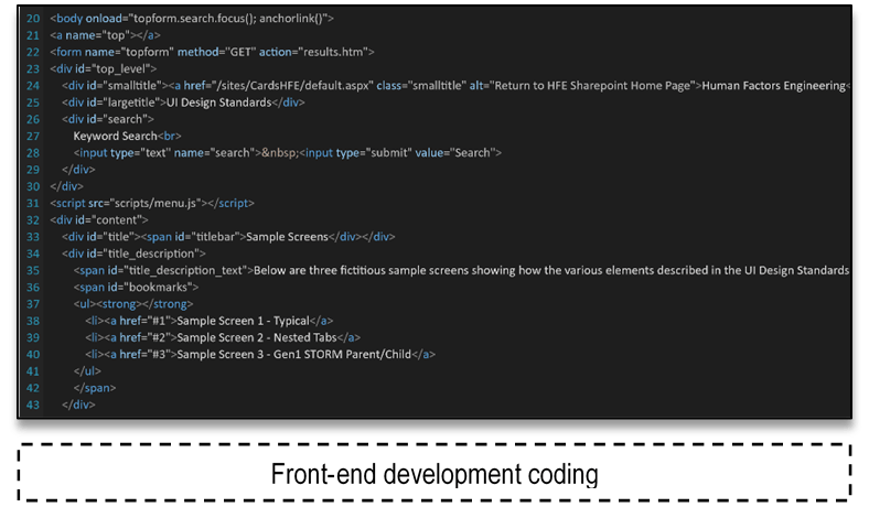
While coding was left to a development team, I created a framework for communicating the application style guide, which served to accelerate onboarding of new hires and act as a repository for design patterns and best practices to be used throughout this enterprise application.
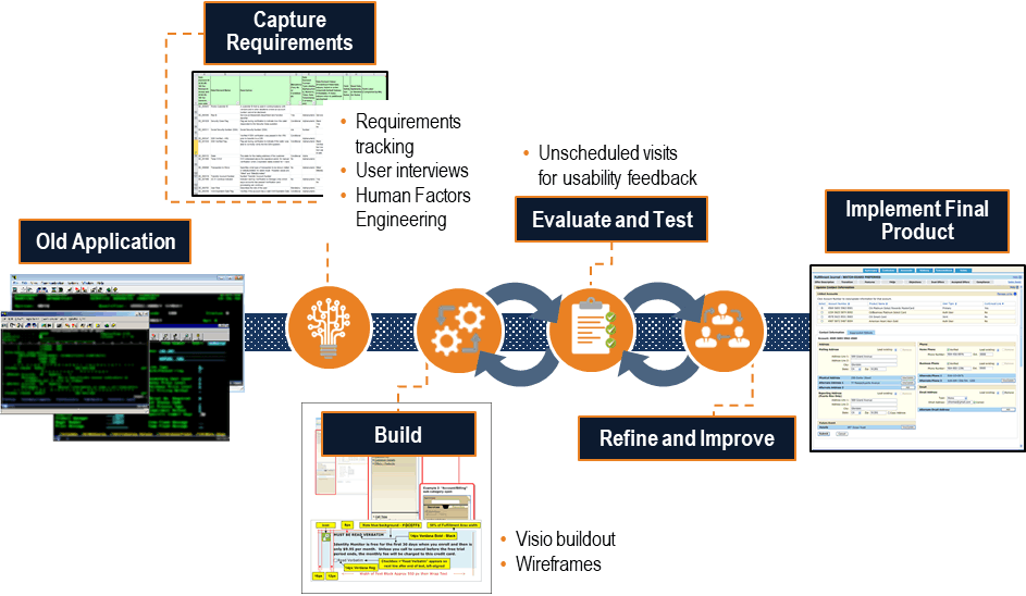
Getting feedback from users was a unique challenge. The MVP was released to a specific subset of customer service representatives, with whom I would make unscheduled visits for usability feedback. These customer service representatives were in a live environment with actual customers on the phone, so post-call follow-up interviews were conducted gathering 1:1 feedback on the interface and user experience, and performance metrics gathered in aggregate. This application turned out to be a great example of how Service Design is critically important to customers who never see the application.

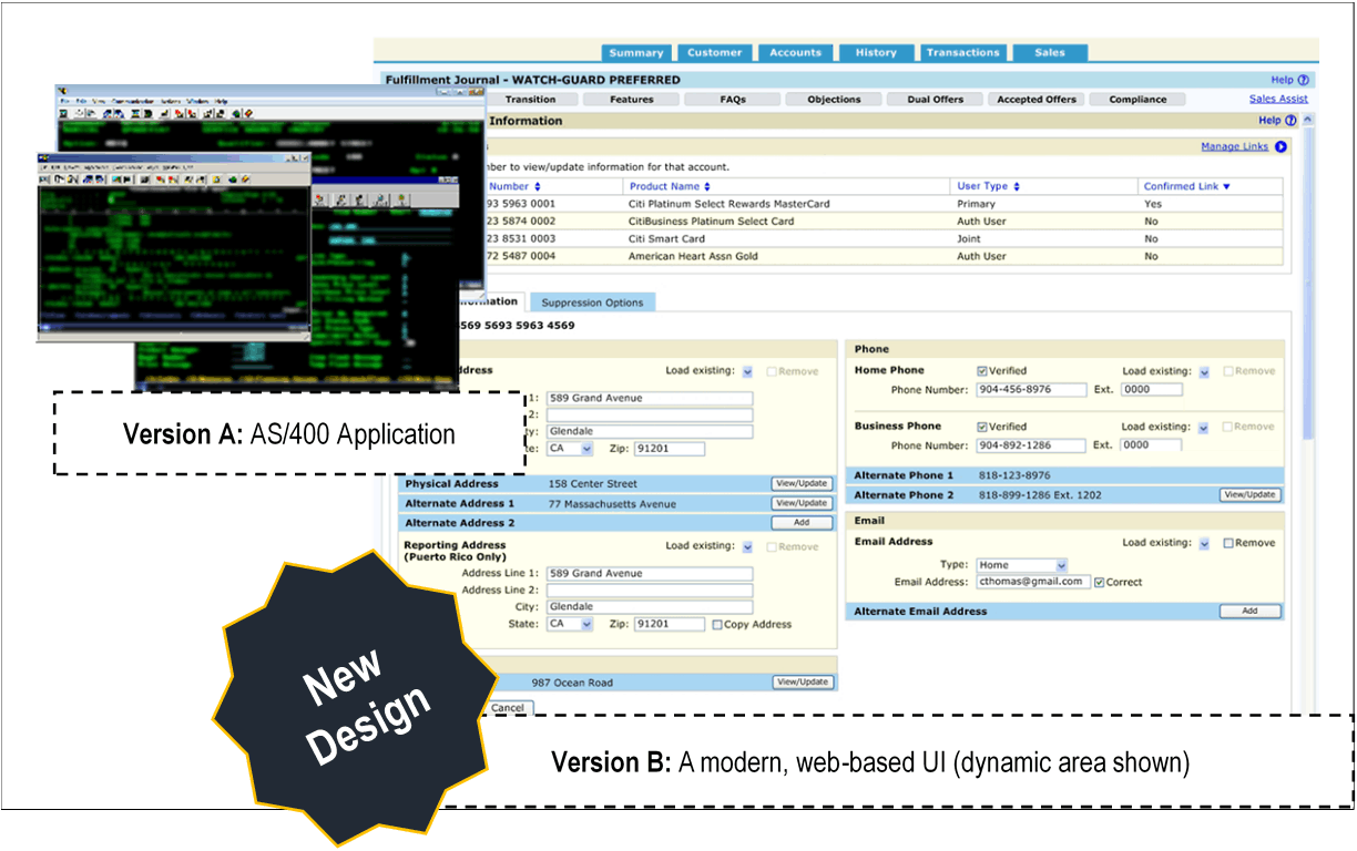
Integrating user feedback from during each new iteration of the product to create a new design that took advantage of modern web technologies and allowed the development team to combine multiple legacy screens into a single screen or flow. This cut call handling time, and increased first-call-resolution and customer satisfaction.

This effort saved over $14M with a highly intuitive UI and UX on the enterprise call center application resulting in 30% increased productivity, reducing training time by 1 week, increasing customer satisfaction with first call resolution. It also reduced average handle time (AHT) from 480 to 270 seconds for sales calls (44% improvement) and 345 to 210 seconds (39% improvement) for general customer service calls through intuitive interface design and usability testing improvements resulting in $16M savings.
The company wanted to update a boring and complicated black-and-white statement to a modern and understandable format. This format would also be converted to PDF for viewing online.
The company wanted to improve the mortgage prequalification flow by cutting the process down to the bare minimum needed for a prequalification letter, as most realtors require buyers to be prequalified before they will show a house..