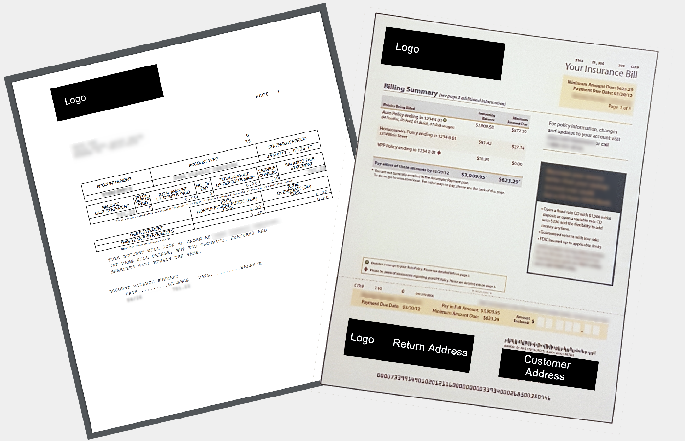
The company wanted to update a boring and complicated black-and-white statement to a modern and understandable format. This format would also be converted to PDF for viewing online.
This is by far one of the most fun projects I've worked on.
Modernize the roughly 40-year-old black-and-white account statement to improve effectiveness, reduce calls, and deepen the customer relationship.
The vendor created initial draft statements. It's always a delicate dance presenting usability findings to internal project teams, but much tougher when communicating negative sentiment to a third-party.
Third-party vendor project team, Marketing, Project Management, Product Management, IT, various lines of business representatives with embedded advertisements
This particular project received a lot of love.
Round 1:
Baseline the existing statement with eye-tracking/performance testing tasks such as total balance, amount due this month, find your account number, etc. I compared the draft of the new statement to see how well it performed with the same tasks. Qualitative feedback on positives/negatives was gathered to make improvements for the next round during the retrospective think-aloud.
Methods:
• Mail Exercise
• Eye-Tracking and Performance Testing
• Retrospective Think-Aloud
• Qualitative Analysis
Some of the things we learned:
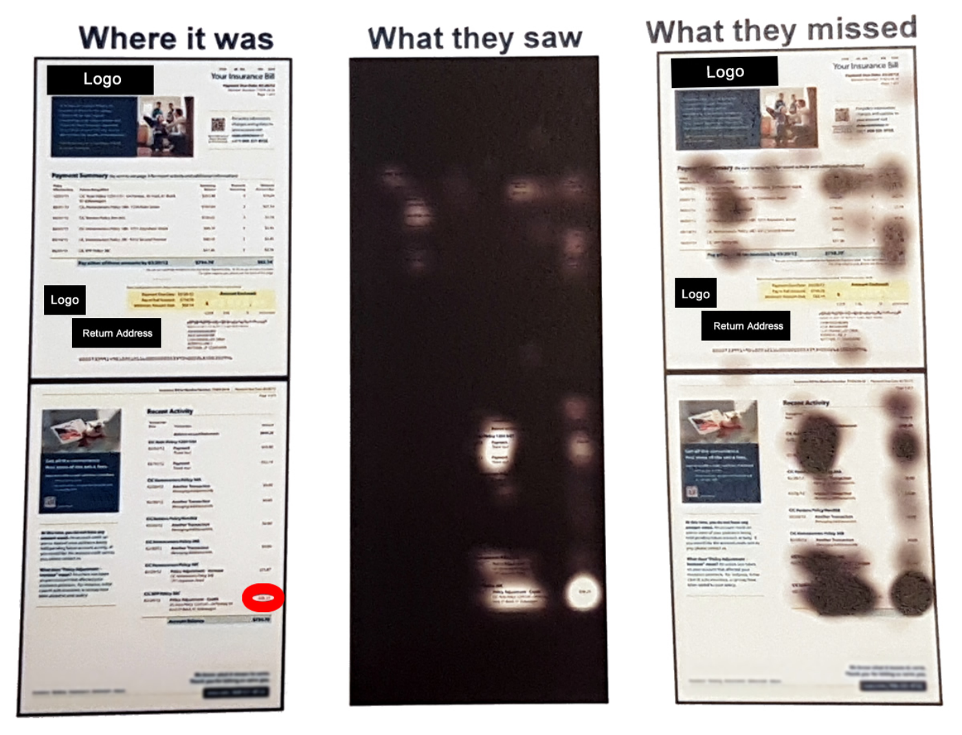
As participants opened the mail, most immediately identified the advertisements by the different paper texture, discarding them without a glance. Tasks on the original statement were difficult to complete because everything was in black and white, and nothing stood out as more important. The introduction of color and a modern design was exciting! Eye-tracking showed the embedded advertisements were rapidly identified as ads, and then ignored by most participants.
Round 2:
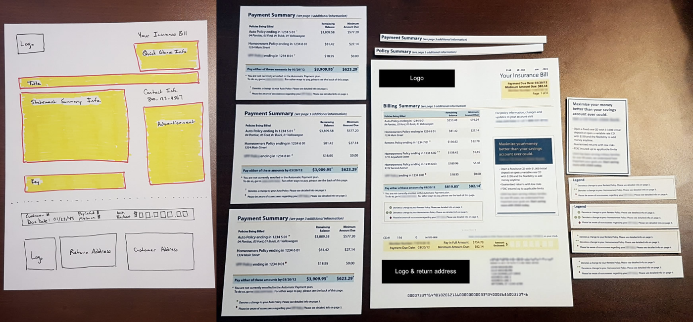
After tweaking the design by improving font sizes, color contrast, and conversational text, another eye-tracking study was completed using the original draft of the new statement, and the updated design. In addition, participants were asked to design their own statement, based on templates the team and I came up with as a result of findings from Round 1. These templates were targeted around the sections of the statement where participants seemed to struggle the most. Qualitative feedback was gathered to gauge level of satisfaction and to uncover any unexpected experience improvement opportunities.
Methods:
• Eye-Tracking and Performance Testing
• Qualitative Analysis
• Participatory Design
Some of the things we learned:
Participants willingly provided more detail in the participatory design portion of the session as they felt more involved and vested in the outcome of the statement design.
Round 3:
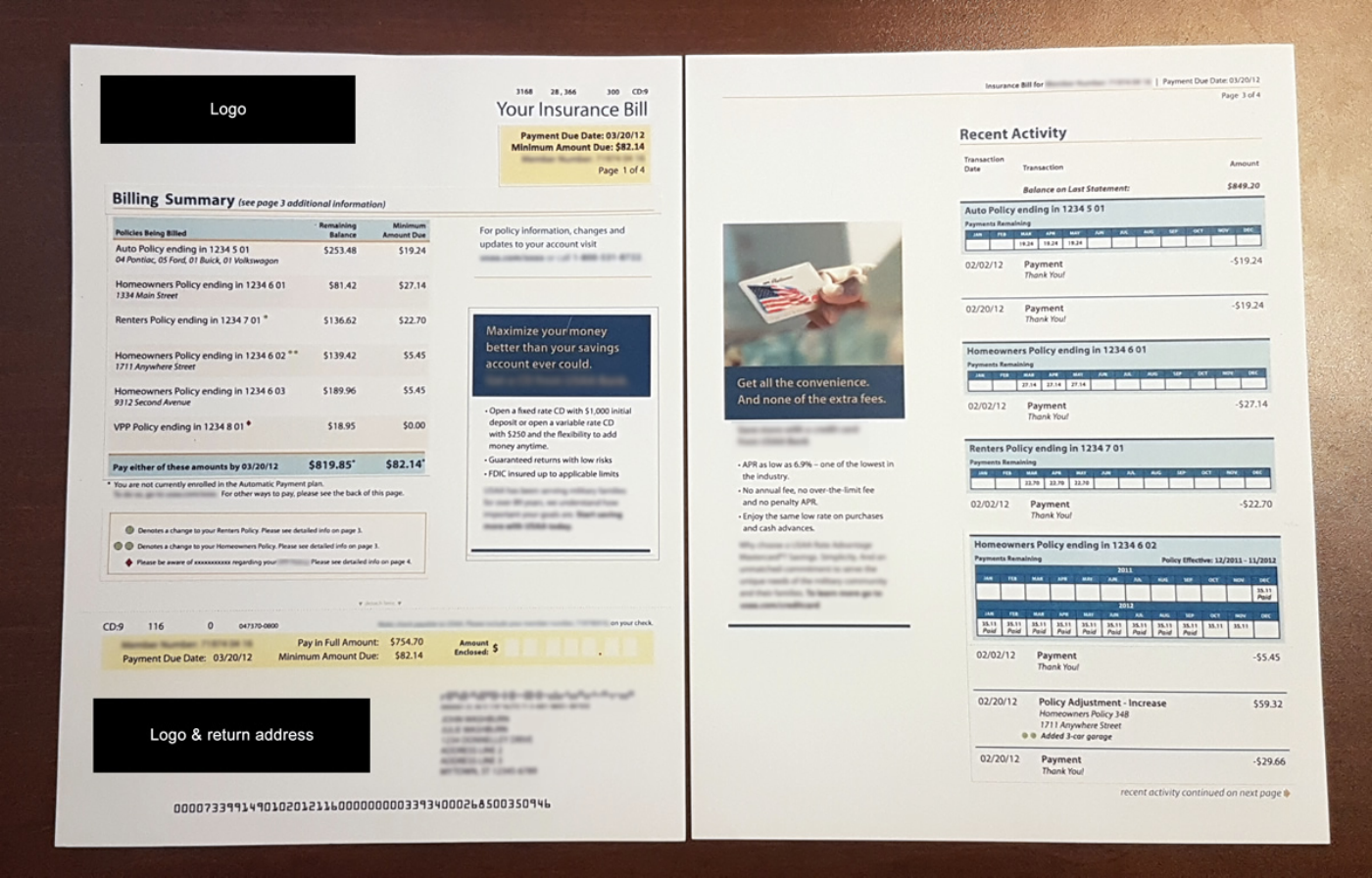
A final eye-tracking study was completed to gauge effectiveness of the participatory-designed statement.
Methods:
• Eye-Tracking and Performance Testing
• Qualitative Analysis
Some of the things we learned:
This project reaffirmed that feedback received directly from users will help improve overall usability. Participants even said they noticed the ads. Instead of saying they didn't know what they were for, they understood the gist of the ad.
When comparing the original statement to the newest, the new design won hands-down, based on usefulness, efficiency, effectiveness, learnability, and satisfaction. None of the participants said they would give up trying to find something on the statement and call. Participants also noticed the embedded ads, which was an improvement over the baseline where they said they would open the envelope and "feel for the different paper", and immediately throw it out without looking at it.
Performance metrics - seeing the new statement for the first time:
Due date: from 37.2 seconds to 3.9 seconds
Minimum amount due: from 9.7 seconds to 1.3 seconds
Contact information: from 21.4 seconds to 2.0 seconds
Account number: from 18.8 seconds to 2.1 seconds
Last payment: from 37.2 seconds to 3.9 seconds
Reason for a price increase: from 66.5 seconds to 2.4 seconds
Total payoff amount: from 32.0 seconds to 1.5 seconds
The company wanted to deepen the relationship with the customer by adding more cards to the customer's wallet without the need for a credit check and without increasing the credit line.
This is a dual-facing experience for customers and internal customer service representatives. The company wanted to improve the mortgage prequalification flow by cutting down to the bare minimum needed for a prequalification letter, as most realtors require buyers to be prequalified before they will show a house.
